First and foremost I want to point out that the look of your website is secondary compared to it’s content. Looks only go so far and if I were to place a number on that on a scale of 1-10, with 10 being imperative and 1 not being important, I’d say 2 or 3 at best.
In other words, having a pretty site does no mean you’ll have a successful site. In fact, my experience has shown me that fancy looking sites in some cases actually do worse because they take the attention away from content which ultimately ruins the user experience, which is actually the most important thing you need to focus on.
But in spite of the main importance being placed on content, how your site looks still has an important role to play, just not as much as many think. In regards to looks, there’s 2 things I focus on when I choose a WordPress theme/s for my sites:
1. What is the niche/topic my site is focused on.
I don’t like to choose themes that are overly fancy colors, graphics, pictures, flash videos and other decorative things. As I said before, this in my experience takes away from the user experience because it distracts them from content and since most people look for content on a website, I want to keep it simple.
Here are 3 WordPress themes I consider to the best for most sites:
1) Zenlite. A very simple theme. It basically allows for content to take up the entire page. If you’re looking for a site that’s almost as plain as can be, this one is good to use.
2) Platform. I actually used this one on this site and I have to say I loved it until I learned it wasn’t mobile friendly (It may have changed since so don’t cross this option out!). It does allow for massive customization and I’m not even using this theme to 10% of it’s potential, but this is more than enough for me since my main focus is content.
3) Twenty Twelve. In many ways, this one reminds me of Zenlite. Also simple to use.
Update: More WP ideas below!
Decorating the theme (template):
Once I choose a template, when it comes to decorating, again I keep it simple. If I add images, headers, footers or other things to decorate the site, I like to only add 1 or 2 relevant images while the rest could be text in proper colors.
Here’s a few examples:
Example 1: Take this site. It’s topic is about making money online. As you can see my header gives the title of the site and there’s only 1 image underneath of a laptop with money signs. This is in my experience more than enough to help anyone who lands on my site know what it’s about. Furthermore, I keep colors pretty simple.
For instance, when I write about programs which are scams, I use red colors. When I write about good programs, I use green colors on some of my text and images with green in it.
The ultimate purpose isn’t to decorate my site, it’s to enhance my content.
Example 2: If you have a dating website and/or relationship related topics, you’d want to add colors such as: White, pink & red, but also keep it simple as to NOT take away attention from your content. This makes your website’s colors seem appropriate while also keeping it clean. As for pictures, keep it at a minimal and related to the content.
Example 3: If I were making a site on say water sports, I could use colors such as white, light blue and blue (related to water) as well as images that are relevant to the content.
Example 4: The only exception on when you’d want to add a lot of images and/or decorate your site is if you’re doing photography. In those cases, it makes sense to focus on that, but even then, content is still more important.
Decorating the content:
Making your content look pretty is the best of both worlds are far as I’m concerned. Besides spelling and simple grammar (no need to write like an English professor), I like to do the following:
Keep my paragraphs short: I prefer 2-3 sentences per paragraph before I go to the next one. That way my content is easier to read.
Add headings (H3 usually). For those of you that don’t know, H3 is just text that is bigger than the rest. It usually is used to catch the eye’s attention. Every few paragraphs, I add an H3 heading to represent that I’m moving into a different subject.
For instance, as you’re reading this post, notice the H3 headings I put up above. This makes the overall article prettier to read and looks more organized.
Add relevant images to enhance the content. Remember I want to make my content stand out more so every few paragraphs, I will usually add an image which enhances the content. Also make sure the size of the picture is proportional to the content. This means, don’t make the the image too big or small, but just enough to help make it look organized.
If for example, I am writing a blog about 5 different exercises, I’d want to add an image of each exercise, every time I move into the next exercise example.
Why high quality content is so important:
People usually don’t come to websites to see how pretty it is. They usually come to websites to find something they’re looking for which is information. When they land on your site, usually it’s because they find you on search engines like Google.
They typed in a keyword (search query), got results and saw your site so they clicked on it. They enter your site expecting to see what they were originally looking for. They aren’t going to your page to look at fancy images.
If they see on your page the content they were seeking, they are more likely to stay on the site, keep reading it and perhaps even take the time to buy something you recommend. If however, most of what they see is fancy graphics and images, it will be distracting and they won’t spend too much time looking for what they want and will usually leave.
In a mix situation, if you have good high quality content and a lot of decorations on your site, it also makes it difficult for the visitor to follow along the content when there’s so much else to look at.
My advice is again to keep it simple:
Focus on content first and foremost and if you need to decorate your site, do it to make your content easier to understand and read. This is what in my experience ultimately leads to better success of your site.
As for themes, there’s SO many available. I recommend sticking to something that’s simple like the ones I recommended above. There is no such thing as the best WordPress theme. There is however what works for your particular site/topic which is why the answer to the original question is it depends! If you’re looking for WordPress themes, I recommend trying out this approach to making my own WordPres websites which can make them in less than a minute.
Update 2/14/17: What’s the best WordPress theme for affiliate marketing websites?
So not all sites are going to be the same:
- Some will be just informative ones.
- Some will be just for people to share their personal thoughts with no monetary idea in mind.
- And some will be aimed at making money and of those, you will have affiliate marketing involved (or something else that’s monetarily incentivized).
With the last case, if you are an affiliate marketer, what type of WP theme should you use on your site? Honestly, the same ones I recommended above with the same ideas of niche and content in mind apply here, therefore the same templates will also be applicable here.
But I would like to 3 more personal ones I’ve used that HAVE made me money in addition to the ones above:
1) Omega
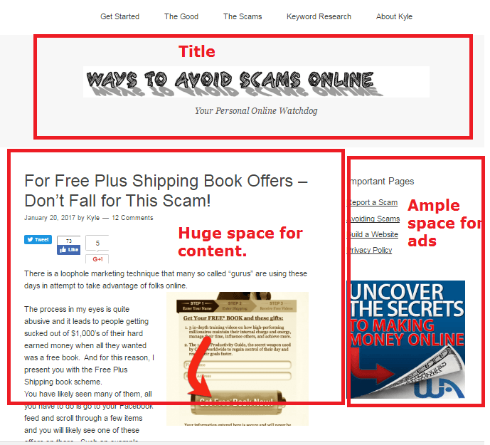
It is VERY simply to use this and it’s very open ended on the content meaning there is HUGE space for content to appear and people to see and read. There is also great space available for ads and the title. The point is, it’s plain, I’ve made money from it through affiliate marketing and I do recommend it. Here is a brief example of what it will look like:
It is also mobile friendly and free. You may want to consider this. The only issue I’ve seen with it is that it’s hard to install SSL on it…
2) Genesis (It’s a premium template)
This is the first paid one I’ve ever used and I love it. Despite being a little bit more intermediate on the coding front, there is much more opportunity to make your blog look more professional through Genesis. At about $99, it’s worth if IF your current blog is making money and you need a look change.
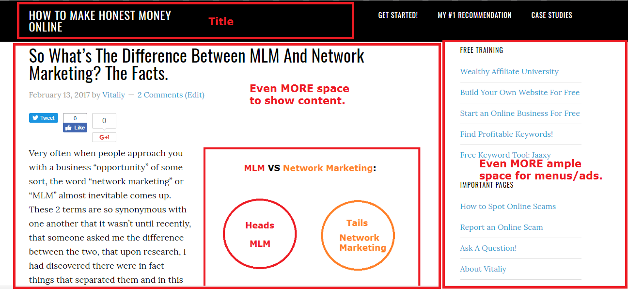
Like Omega above it, Genesis has even more space for content and more viewing ability for people. Here is an example:
I very much enjoy this theme and have recently made the switch from Omega. I would say the only con is that it’s a premium one meaning it costs money, but the biggest plus is that it was easy to install SSL on the site.
Other than that, when it comes to affiliate marketing, I have not noticed any changes to my sales figures, but it is still early to compare.
3) Generate Press
It is fast, and is great for just about every kind of website you can have. It is also a mobile friendly theme and contains many elements which Google uses as ranking factors.
One thing I will say is that every theme I’ve mentioned here has made me money and it’s because the look of each of theme is kept simple and focused on the content. As long as that focus is emphasized, the theme you choose will make money.
Ideally, you will want your theme to also be:
- Mobile friendly.
- SSL friendly.
These are 2 additional things I’d like to add which are important for ranking and getting more traffic.
Now I’d like to ask you personally which theme/s you have used, for basic purposes and affiliate marketing purposes. Which ones worked? Which ones didn’t?


Hey man, thanks for the review because i’ve been trying to find a theme that suits best for affiliate marketing because I need a theme that can show that I’m indeed selling something and not just looking like a normal blog that just provides content. I’ll try to look into your Genesis theme and see it if fits my niche.
Odds are it will fit just about any topic Nico as Genesis has some great editing options to change the color and look of the site so it maintains a high emphasize on content and the color can also fit in with the niche topic, but it is $99.
Some of these themes I will definitely need to check out! I actually use the theme called “writerblog” and to be honest I think it’s great, very simple and easy to navigate but also sleek and modern in my opinion, really fits well for the affiliate marketing/blogging sites. Do you really recommend buying the genesis theme? Is it really worth a penny that pretty?
So far I’m pretty happy with Genesis Lorenzo, but I’m not the type of person who fully utilizes the power of a theme I’m given, therefore a free one suits me fine. The content is what counts. The only reason I switched to Genesis was due to it being easier to make my site SSL friendly.
I will definitely try these above two themes mentioned in this post for my future website. But I’m currently using Sydney theme for one of my affiliating marketing website and I’d say Sydney is one of the best themes ever for you to develop a creative and well-organized website. Very visual and easy to develop. You should check out this theme.
Sounds like an interesting theme Minh, I’ve never heard of it, but I will take a look!
Wow, an eye opener. I always thought that the first impression was what counted. I can see that is not the case and I thank you for that solid proven advice.
Content, someone once said is not King. I don’t know why they would say that, also they provided to substantial evidence otherwise.
From Wealthy Affiliate I have always been taught that content is indeed King.
Thanks for the share. I am off to streamline my site. I do think you are right. To many bells and whistles and it detracts from the content. Good content means good conversions.
That last sentence hits the mark James. Good content is everything.