Have you ever been on a website, tried to exit it and had a pop up appear asking you to stay or sign up to some email list? Probably, since these things are very common to see.
But let me ask you this: When it happened, were you annoyed, angry or did you like the message and sign up?
This is an important thing to ask because there’s circumstances in which people all across the world visit websites with these things working and sometimes they trigger the above emotions.
Depending on the situation though, these things can be used positively to do things like grow an email list and make more money and negatively where things like the person can get annoyed and hate your site. So let’s try to aim to be on the former side here. But first, let’s define what they are:
What are exit pop ups?
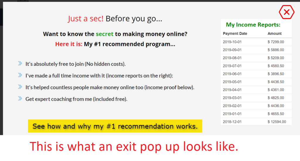
They are ads or opt in pages which show up when you try to leave a particular site that set them up. I have one on mine for example and I set it up using a program called Thrive Leads.
Here is an example of one I use:
The reason (intent) exit pop ups are used on websites:
The basic idea behind them is that they aim to collect the email list of an income visitor who may or may not want to visit the page again. Sometimes people who visit our pages like them, but for whatever reason, they leave. For example:
They may be browsing the internet, they find our page, like our stuff, but work gets in the way or an event happens which distracts them, the computer may shut off, another site may show up, slow attention spans can lead the person away from your page and so on…
And most of the time, they won’t remember your page at all, let alone the URL that got them there, so consider that a lost lead, a lost visitor, never to return again. In very RARE cases do people love your blog/page so much that they bookmark it or return to it through their will.
When you analyze what I just said with numbers, here’s a scary, yet real statistic…
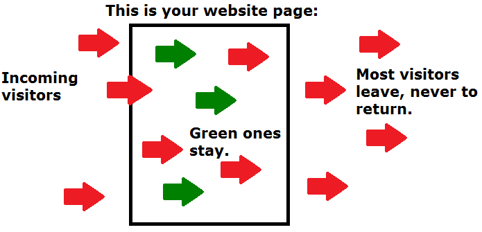
On 99% of websites, 99% of income traffic LEAVES, and never returns for a plethora of reasons.
That means if you’re trying to make money online, you’re really only counting on 1% of remaining traffic to buy from you. Here’s how it can look (optimistically):
Just imagine trying to sell to 100 people and only 1 person buys. The other 99 leave. You’ll only make $1 out of every 100 people.
That’s some crazy, lost money, but it’s an unfortunately true stat and reality that most pages face, including my own, except in my cases, it’s more like $2-$3 made, but that’s not the point, the point is that most traffic leaves, period.
However, exit pop ups help push that stat in your favor, here’s how:
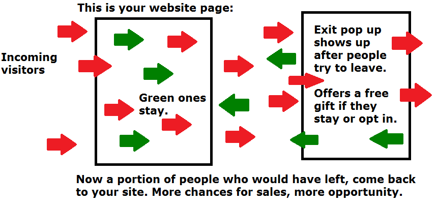
With the 99% of people who leave, the owner of a page can install an one of these things to try and change the persons mind about actually leaving.
This at least offers some sort of GOOD obstacle to come between the person and their leaving action vs there being no obstacle between them and the X button for your page window and that person never coming back again.
Here’s how an exit pop up can bring back your “lost” traffic:
And in most cases, the way that these exit pop ups work is that they try to “bribe” the person leaving into staying through one or more of the following things:
- A free eBook.
- Free training.
- Some sort of free gift.
- Ect…
But in order to get these things, the person leaving needs to OPT IN and give their email.
And when that happens, there is an awesome chance (if the website owner is competent) that the person who leaves changes their mind and/or opts in and if they do that latter thing, then the page owner can stay in touch with them and continue to gain their trust through email communication.
Now I don’t have exact numbers for how well exit pop ups work, but I can tell you that when I first started using one, I curbed the 97% stat I had of people leaving to 95%. While that doesn’t sound like a huge change, 2% is actually a whole lot more people I can advertise to, since each lead I have has the potential to earn me $100’s every single year, so 2 or 3 extra people who want to leave my site but opt in when leaving can potentially turn into a $1,000 worth of profit, so yeah those 2% make a HUGE difference.
But in my case, I’m still in the preliminary stages of testing my exit pop ups, so they’ll likely be bigger if I get it done right, but I’m moving away from my main point which is…
Exit pop ups can lead to huge email lists and those can lead to great profits:
Cold leads who wish to leave your site can turn into warm and hot leads through email marketing, so if you can get a person who wishes to leave your site to stay with the help of an exit pop up, every single lead counts.
They don’t always have to be leads which you aim to sell to. They can be leads which turn into people who love your content, return back to it, share it and thus get it more exposure, and that itself is a valuable asset to have, all thanks to having this tool installed.
The right ways to use exit pop ups (without annoying people):
1) Make sure your site is already delivering good niche content.
2) When people inevitably leave your page, make sure your exit pop up is quick to read and easy to see the benefits of. Give them a quick “Just a second!” message and tell them they’ll get a great gift that should ideally involve something with the niche topic in mind.
For example: If your niche site is on belly fat loss and they leave, make sure that exit pop up gives them for instance 10 free fat loss tips they can drop so and so weight with in days. Give them a good hook to see the immediate benefits of.
3) If you are doing this stuff on a sales page and people leave, have them leaving trigger a discount if they stay and buy it. This is commonly used on MANY product pages these days and it works.
These 3 tips should give you a decent conversion rate of people who leave your page. The next step would be to try and get a decent exit pop up set up. Here’s the program I advise.
The wrong ways to use them:
1) Do not make your messages for people leaving incoherent or long. The people leaving have already set their minds on the X button or just clicking out, why make it tough for them to read whatever it is you have to say as they are headed out? Make it simple.
Instead of leaving long messages to sign up, give them a clear 1-2 sentence call to action to stay and get great stuff if they do.
2) Do not by any means sell them anything as they are leaving. They are already out of your page, why would you want to make them run out even faster? Encourage them to stay with a hook like the one I gave you above.
3) Be careful not to “activate exit pop ups” too early. They can hit your rankings hard through negative SEO. I usually only have them “pop up” on my website if people wish to leave on their own, giving them ample time to read my content.
What’s a good indicator that you have a good exit pop up working for you?
I suppose the best way to tell if your exit pop up is working and/or going to annoy people or not is based on numbers. You’ll have to see how many times it gets displayed for people vs how many times it gets signs up, then if the resulting number is above say 5%, then it’s a doable figure, 2 digit conversions or higher is even better.
Second indicator: Testing is imperative.
You will absolutely need to test multiple versions of an exit pop up to see which one/s are converting better. There is no better way to gauge if a theory, especially in this field is working well than to test different versions of a page trying to get people to opt in who are leaving.
Be prepared to risk traffic getting lost for this to happen, but hey, they were already leaving, so it’s not a big deal! Here’s some opt in ideas for you to experiment with, just remember, it has to be a simple, short call to action, that will typically get the best results.
My final thoughts: Ensure you have a good funnel in place before doing this stuff.
A poor performing exit pop up is not typically going to be the source of your website’s problems, it can actually be your page itself. If your whole funnel is not set up properly to flow, attract the right audience and keep them hooked with good content that isn’t interrupted by bad content or ads, then you should ideally get less people leaving, more people buying and even those who leave, a high number will opt in back to your page.
Think of it this way:
If I attract a highly relevant audience to my niche site by writing great content for THAT specific audience, then they will be more interested in it and when some of them leave and I offer them a free gift to opt in, they are more likely to take it, given that they were to begin with a relevant audience and that my free gift will make them feel there’s more value in staying/opting in. This is how you should approach this subject.
To make sure such things are set up the right way, I’d advise guidance from the top program in this whole field that teaches this: Wealthy Affiliate. Check them out! I use their tips to make sure all my sales funnels are in sync with one another!


I have just started experimenting with exit pop ups on my website. One thing I would like to know is if you would recommend having an exit pop up on every page or only on pages that gets the majority of the traffic?
Does doing it on every page come off as spammy or too aggressive as far as selling?
That’s a great question Jessie and to be honest, I don’t have a definitive answer for this. Currently, with my exit pop up experiment, I run it on nearly every single page. The exit pop up leads to my main offer and on that page, I do not have the exit pop up working for me.
I would say it needs to make logical sense. For example: I’d probably run it on just about every important page you have that gets traffic and if you’re collecting an email list through that option for instance, and sending people to a confirmation page once they sign up, don’t give them the same exit pop up (or any at all) on that page.
Or in my case as I said, don’t give them the same exit pop up on the main sales page you’re sending them to. It’s all about keeping their experience on your site high and wanting to see more.
I have been skeptical about exit pop-ups for a while now, but your post made me change my mind. I will add some pop-ups using MailChimp and also create a landing page along with my pop-up. As you pointed out, I need to test what works best. I guess people want free and quick information this is the age we live in. I enjoy lengthy thought provoking content but most people just want their answers quickly. With exit pop-ups, I will try to improve my bounce rate.
Hi John, if you’re going to use an exit pop up, make it simple and fast to read. People really do enjoy the quick aspect of seeing the benefits, but keep in mind that they are aiming to leave your site, so you need to change their minds as quickly as possible, so utilize bullet points and a reason for them to stay (offer value).
In general, what you say about lengthy content is good, as long as it’s written well, but in the context of the user who wishes to exit, do not give them long content, keep it short.
I’m thinking of using exit pop-ups for my site and I see many sites do that so I guess it works. I wonder whether I should do it for every page on my site or just select some of them. And how many people should ideally sign up for your e-mail list per every 100 visitors? Does this depend on a niche?
There’s a number of questions here Furkan and I will try my best to answer them all:
You should be testing your exit pop ups in the sense that you should see which version of it produces the best/most sign up rates. For example, I recently made a few changes to mine and the sign up rate went from 5% to almost 8% which already proves I’m doing something better than before.
While you should always strive to try and get the most people to sign up, its just part of the overall game, you also need to consider a few other things:
1) Do you even need an exit pop up?
2) Is there truly good value in people signing up to your email list? If so, then let them know the benefits of opting in and this should increase sign ups.
3) Can you provide your email list with consistently good content and give them enough value to remain a subscriber? If so, then do this.
As for your first question on where to place the pop up, for starters, I would suggest placing it everywhere on your site except the page which confirms they signed up to your list. See how this works.
Hi Vitaliy, if there’s going to be a pop-up then let it be and exit pop-up. Personally, I find it extremely annoying to have a window interrupt my reading of an article when I’m half-way through. Your approach to pop-ups is the polite and smart way to go.
The statistics that you give came as a big shock to me. The exit pop-up for me is the obvious route to take if you want to try and clinch a few extra visitors. I appreciate the justifications that you give for your use of this and like the way that you have set yours up.
Brian
Hi Brian, I personally agree with your point of view here in that I also dislike when I’m reading content, if a pop up shows up, but I suppose testing to see which option delivers more opt ins and conversions will solidify this theory. As of now, I’m sticking to the exit pop up one.
Hi dear.
The problem we normally have is that some of this pop-up and exit pop-up tend to slow down our browsers and it normally increases the tabs or the windows and some times why I don’t like them is that at the end when you then wanna pay attention it will either link you to a bad site or spam site and it is really annoying. But i just saw yours now and it is very simple.
Hi Matron, yeah the examples you described are the bad types of pop up/exit pop ads which are normally on spam, malware type websites, but again, it’s all about the type of ad you use and it can be completely legitimate. Glad you liked mine by the way 🙂