Making banners and putting them up on a website is easy. In fact, designing them is rather simple as you can use simple images, programs like Canva and others to make easy call to action images or text to get people to click them.
The hard part with banners though is this:
- Designing them so they get attention, clicks, sales and profits.
- Positioning them on a website in the right spot so they get those results.
And this is what I want to help you do correctly so you can create your own profitable banners and make the most with them. I’ll personally show you what kinds of banners I use and WHERE I place them on my site, as well as how they directly helped me make more money from this site.
So let’s get into this:

Why I decided to write about this:
If you are currently running a website with ads and banners, chances are you may not have them placed properly throughout your site and could be inhibiting your sales in the process. That and their design might also be impacting your sales negatively.
This case study really came about by accident because the specific banner I want to draw your attention to actually disappeared for about a month due to what I believe was a WordPress update that removed the code which made it appear. And in that month that it was gone, I will share what happened and frankly, it’s quite shocking.
Why positioning of a banner matters for sales:
Putting it in places that interrupts people’s view makes them less likely to click it.
Putting in too many places makes the banner look like it’s spamming.
Putting it in the right spots when people are ready to learn more or buy is when they are likely to get the right attention.
The 4 areas of a website where you can place a banner:
There are many different ways you can arrange a banner or banners on your website:
- You can have it be a pop up window which directs people anywhere.
- You can have banners arranged on either side of your website (left or right).
- You can have banners put on the bottom of all your content pages and posts (that’s the one we’ll focus on most).
- You can really put them anywhere depending on the type of website you have. With proper coding knowledge, almost anything is possible.
There are people who don’t know this that leave this entire topic alone and just build out content and then there are those who do know this that in some cases spam their website full of these things in hopes that people will visit what they want them to so they can make money.
I made a case study regarding a side ad I placed that received a lot of clicks but in the end lost me sales and in that case study, I pointed to the mistake of placing all those banners on one page because it confuses readers and can hurt conversions. Basically I told people NOT to do this! Also side banners generally get way less clicks than banners in other areas of a website.
In my experience, the fewer banners you have and the more they all point to one direction, the better. Nothing is worse for a reader who comes to your website to see different banners leading to different pages. It confuses them outright and to make it one banner or even just a link going somewhere makes it very likely they’ll do it and even more simpler.
Think about a website like this, someone comes, reads about a program they were looking into, find out it sucks, but then naturally want to know what doesn’t, and see tons of banners all saying different things about making money.
You would think lots of choices make it better, but for general cases, no. Having so many banners saying “This will make you money” actually makes people less confident in clicking on it because they are going to wonder if another banner they could have clicked on would have led them to a better place. That’s why if there’s 1 choice, there’s less chances people will doubt themselves.
And that leads to my simple banner example that works:
The same people I talked about earlier who have pop up ads on their site who are having success with it also have banners at the end of each article they write. I decided to try the same idea on this site, made a simple ad and had a friend put up the code for it.
Here’s how it normally would look:
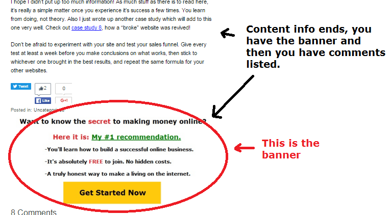
To get a better view, just keep scrolling (or reading) to the bottom of this post and you’ll see it. It’s on every page I write. As you can see, it is a very basic image that anyone can make in just about any program. I saved that image and link it to my Wealthy Affiliate page.
The object besides getting more conversions is to help people out. They read the article I wrote, they read whether something is good or bad, but want to know where they should go next. Well that banner answers that.
I’ve used this banner for years and here are it’s stats:
Since it’s creation, I have not taken it down, and it’s gotten over 50,000 clicks on it! Those clicks led people to my Wealthy Affiliate review page, and from there, more people saw my offer and purchased it thanks to this banner alone.
I don’t have an exact figure of how much extra this banner brought in for me, because I wasn’t tracking every single detail of it, but with 50,000 extra clicks to an offer I promote heavily on this website, you gotta believe it led to at least a “few sales”.
And by the way, notice how simple it is. Setting this up took me about 10 minutes but the simplicity of it, as well as the call to action text and design makes people click it.
I created that banner in Microsoft Paint and mimicking something like this is very simple.
So obviously the banner worked right? Yep! More evidence showing it:
So before my banner was up, I was obviously not getting extra clicks to my main Wealthy Affiliate offer, but once it went up, this happened:
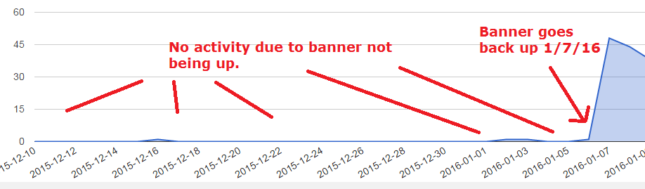
In it’s first day, the banner picked up about 46 clicks. And that continued, up and down for the continuation of several years, all the way till today. This is why that number has reached over 50,000 since.
One more case study which is on exit pop up banners (they work too):
When my site grew to a certain point I decided to invest some money into a software that would let me build exit pop ups and there is one I’ve also been consistently using in addition to the current one at the bottom of my every page and post on my site.
Here is what this exit pop up banner looks like:
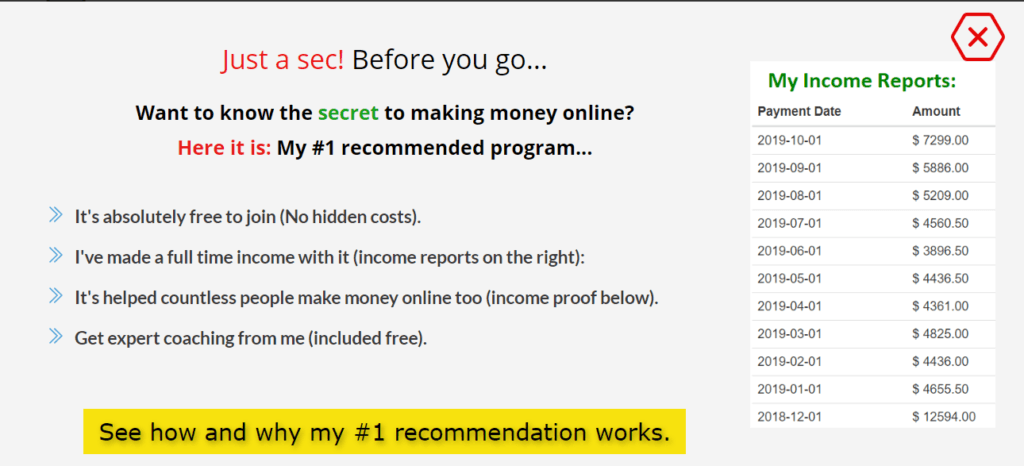
It went up many years after the other one was up, and is getting close to reaching 10,000 clicks (on the yellow button).
Since my site talks about making money online, this banner reflects that but showing people stats of the money I make money and gives them quick bullet points on what I have to offer. This gets clicks and again, this page funnels into my Wealthy Affiliate page, and this has also led to more sales.
5 things you need to know about creating profitable banners:
Place them in areas where they will not interrupt people’s reading: Side bar, bottom of the page and every few 100 words on your blog posts is fine, but don’t use too many of them.
1) Keep the banner looking very simple if you are the one making it. You already saw how my banner kept it simple and the results it got.
2) Design your banner in places like Canva.com. It’s awesome.
3) Consider exit pop up banners as they tend to get you more clicks.
4) Design your banners with short bullet points and simple text that fits the context of the site (see my exit pop up example).
5) Use tracking on the banner to see if it’s actually getting clicks to determine it’s success. If you run a WordPress site, use Prettylinks.
And this basically summarizes how to create profitable banners!
Hi, thanks to great content on the banners. Sometimes I feel that I know so little about the banners, and every day I’m surrounded by them. I have my own page and now I use only the side banners, which are associated with the content of the page. Personally I do not like pop up banners, they are annoying.
Hi Vitaliy,
Very interesting case study regarding adverts and where to place them for greater click through rates.
Out of interest and in order from your experience what converts better ads in header, footer, side bar , content (top) Content (Middle) or content (bottom)?
Also If I want to add an advert at the bottom of all my post how would I go about doing that without manually doing it for every single post (I have 200+ posts – is there a quick way?)
I have personally found banners at the bottom (footer) of my articles tend to get better click throughs because they allow the user to first marinate (read) the content before being open to my suggestion. Maybe a pop up banner works too, but I have yet to try those.